7 Inspiring Web-Design Trends for 2022

Web-design is basically the internet’s architecture industry. Within the e-commerce sector, there is zero chance of business success without taking time to design and maintain a smart website.
Websites are e-homes for online businesses and that’s why it’s important to consider how to design an attractive company website that instantly connects your business to your customers.
As our time spent online increases, web-designers have to visualize and create accessible websites that are easy to navigate and able to provide a seamless flow of useful information.
The constant evolution of web-design techniques has established a wide range of emerging trends that will help your online business stand out in an increasingly saturated online market.
From page speed optimization to split-screen websites, in this article, we will highlight the top seven trends that we think will have an impact and shape the world of web-design in 2022.
1. Page Speed

Consider that 53% of web-users will abandon a website and move on if it takes longer than 3 seconds to load. Website loading speed has always been, and continues to be a top priority.
With Search Engine Optimization [SEO] being a crucial consideration for web-designers, it’s important to note that Google’s latest 2021 algorithm update prioritizes website loading speed.
Common causes for slow websites are too many fonts and non-optimized images. Try to avoid developing a website on a platform that relies mainly on heavy plug-ins for design functionality. You can establish and maintain optimum speed performance by taking the time to analyze your website’s loading speed with monitoring tools like Lighthouse or Google’s PageSpeed Insights.
2. Inclusive Design

More than ever before, web-designers are striving to design welcoming digital spaces that are inclusive and able to offer human empathy aspects within an artificially-designed environment.
Accessibility is fast becoming a top priority for web-designers and that’s why accommodating your users’ needs and desires within your web-design will only help retain long-term customers.
Providing voice-enabled control, as well as theme and font customization options within your web-design can make your website more accessible for people with limited hearing and vision.
Finally, acknowledging the important social impact of language use, many renovated websites are choosing to publish and integrate gender-neutral language and content within their designs.
3. Scrolly-Telling

A more recent buzzword within the world of web-design, scrollytelling, is also known as ‘narrative visualization’. It’s all about leveraging a digital space and sharing captivating stories.
In a website environment, scrollytelling is essentially a series of audio-visual elements, arranged in a chronological order, and engaging website visitors with an immersive message or story.
Able to combine data, photography, illustration and sound with equally appealing text and typography, scrollytelling establishes a responsive and interactive online user experience.
Increasing your online brand’s user engagement, stunning scroll-based layout designs and visualizations make visitors want to read your company’s message or story to the very end.
Specialised in corporate IT development, our website and application designers take into account a range of criteria to offer you the best digital products adapted to your needs.
4. One-Page Websites

Always aim for simplicity whenever you can. Simple techniques and procedures are often the most effective at attracting and retaining tech-savvy online customers with no time to waste.
If you want your online business to grow, you should get rid of any potential barriers to customer engagement. If the subject-matter is appropriate, sometimes one-page websites are ideal.
Favoring simple scroll navigation over fancy drop-down menus and pop-up forms, one-page websites are great for portfolios and for effectively presenting a single brand campaign idea.
Designing your website in a way that makes the user feel like they are holding a flyer or looking at a poster, is an effective way that allows you to present all useful information on one page.
Experts in software development, you can contact us for your digital product development projects.
5. Kinetic Fonts

Kinetic fonts – or animated typography – is another rapidly evolving web-design trend that demonstrates promising potential for transforming how good communication takes place online.
Benefits of using animated text include being able to capture a user’s attention, establishing an atmosphere, emphasizing important elements and guiding the user’s eyes through a website.
Transforming website text from being a static visual element into an interactive user experience can be easily done by triggering animated effects every time a user’s cursor hovers over text.
In the future, as web-designers continue to explore the potential of animated text, we can expect to see web-text elements that provide users with functionality and aesthetic appeal.
6. No-Code Design

There was a time web-designers had to have heavy coding experience in order to create amazing websites. That time is long gone, welcome to the age of no-code website design tools.
Increasingly, corporate teams are reducing operating time and costs by using easy no-code software in order to design websites that suit their unique workflows and customer expectations.
More importantly, the fast and easy, drag-and-drop functionality of no-code web-design tools, essentially enables more employees to cheaply produce valuable web assets for their company.
Apart from saving money and making web-design more accessible, no-code software fosters innovation by allowing companies to easily experiment with different design and business ideas.
These days, it’s not easy to find a web developer. We recruit and build teams of web developers for companies.
7. Split-Screen Websites

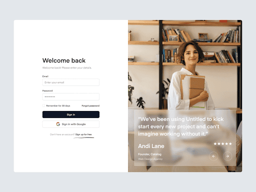
While dividing the screen into two or more parts has been a widely effective technique within the TV and cinema industries, split-screen layouts are a relatively recent trend in website design.
Dual layouts look great because they can be adopted for different screen sizes, isolate and highlight visual elements, establish contrast and color schemes and separate website content.
Split-screen websites are most attractive if your online business has to equally promote two or more ideas and simultaneously allow the end-user to quickly navigate and select between them.
Examples of businesses that could benefit from split-screen web-designs are brands offering product comparison services, as well as travel agencies using images of stunning destinations.
Does your business have a website you want to take to the next level? At Bocasay, providing companies around the Bocasay is a web development company that offers services in website, web application, mobile application and software development.